Select Fields (Single & Multi)
Format your Airtable Single Select and Multiple Select fields as tags, lists, card grids, or checkboxes in your documents.
Overview
Select fields in Airtable appear as colored tags. By default, TypeFlow displays them as plain text in your documents. But you have several formatting options depending on your template type:
Single Select:
- Format as Tags - display as a colored tag
- Show All Options - show all choices with the selected one checked
Multiple Select (HTML Template Builder):
- Text - comma-separated values (default)
- Bullet List - vertical list
- Tags - colored pills matching your Airtable colors
- Card Grid - customizable grid layout (2, 3, or 4 columns)
Single Select
Format as Tags
To display Single Select fields as visual tags:
- Map your Single Select field to a variable
- Click the three-dot menu (⋮) next to the mapped variable
- Select "Format as Tags"
The field will now appear as a styled tag in your PDF instead of plain text.
Multi-Select Render Modes
Available in the HTML Template Builder only.
When you map a Multiple Select field, click the three-dot menu (⋮) and choose a Render Mode:
Text (default)
Displays values as comma-separated plain text.
Pool, Hardwood Floors, Smart Home
Bullet List
Displays values as a vertical list.
- Pool
- Hardwood Floors
- Smart Home
Tags
Displays values as colored pills, using the native Airtable tag colors. Colors are matched automatically - light backgrounds get dark text, dark backgrounds get white text.
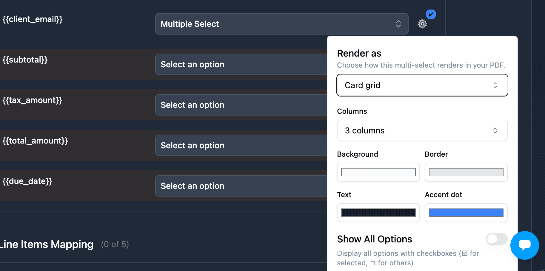
Card Grid
Displays values in a customizable CSS grid. Configure:
- Columns - 2, 3, or 4 columns
- Card background color
- Card border color
- Card text color
- Accent dot color
This is ideal for property features, service tiers, team expertise areas, or any visual list.
How to set it up
- In your HTML template, add
{{Variable Name}}where you want the multi-select to appear - In the mapping panel, map it to your Airtable Multiple Select field
- Click the three-dot menu (⋮)
- Choose your Render Mode (text, list, tags, or grid)
- For grid mode, configure columns and colors
- Generate your document
No loop_0, no linked table needed. Just one variable.
Show All Options
Works for both Single Select and Multiple Select fields. Displays all available choices with checked/unchecked indicators.
- Map your Select field
- Click the three-dot menu (⋮)
- Enable "Show all Options"
Result
All options from your field will display, with only the selected option(s) checked:
Status:
☐ Draft
☐ In Progress
☑ Completed
☐ Cancelled
FAQ
How are Select fields displayed by default?
By default, Single Select fields appear as plain text. Multiple Select fields appear as comma-separated values.
Can I display all options with checkboxes?
Yes. Enable "Show all Options" to display all choices, with only the selected one(s) checked. This works for both Single Select and Multiple Select fields.
Are Multi-Select render modes available in Google Docs?
The render modes (text, list, tags, grid) are currently available in the HTML Template Builder only. In Google Docs, multi-select fields render as comma-separated text or as tags with the "Format as Tags" toggle.
Do I need a linked table for multi-select rendering?
No. The render modes work directly with your Airtable Multiple Select field. No loop_0, no linked table needed. Just map the field and choose a render mode.
Related Articles
- Checkbox Variables - Display checkbox fields in your documents
- Data Formatting - Format dates, numbers, currencies
- Conditional Sections - Show/hide content based on field values
Need More Help?
- Email: support@typeflow.us
- Chat: Click the chat icon in the app